Author Archives: Dr. Sarraf

Two-Way Repeated-Measures in UX

In addition to the one-way Repeated-Measures, ‘Two-Way Repeated-Measures ANOVA’ can also be conducted in UX studies. To show a real example, here is how I did it for my MS thesis…

For the purpose of this study, I conducted a 2 x 3 Two-Way Repeated-Measures ANOVA in order to examine the effects of two levels of search engine,  Traditional Search Engine (TSE) and Social Search Engine (SSE) and three levels of task type, objective, combo, and subjective search queries. The measured variables (or Dependent variables) were time on task, task completion, satisfaction, and emotion for each search query experience.

Abstract
20 participants performed six tasks, each at three levels; objective, combination, and subjective task-levels. Participants used Traditional Search Engine (TSE) and Social Search Engine (SSE) in order to perform the tasks. The purpose of this study was to examine whether SSE improved efficiency, effectiveness, satisfaction, and emotional experiences of users during web information retrieval. The hypothesis was that SSE, as opposed to TSE, would enhance user’s search experience. The results suggested that, while it took longer to find specific subjective information, task completion, satisfaction, and positive emotion was significantly higher using SSE for subjective tasks. In other words, using SSE for subjective queries enhanced effectiveness, satisfaction, and positive emotions of the participants.

Methodology
There were three levels of tasks: objective, subjective, and combination tasks. At each task level two tasks were assigned. Each task were to be performed using both SSE and TSE. The types of tasks were different types of information retrieval tasks at these three different levels. In other words, each participant completed a total of six tasks, presented as six different search queries.

The data sets were coded by time on task, task completion, satisfaction rate, and emotional state. To illustrate how the coding would look like for one case, let us say that a participant, using Traditional Search Engine (Google), took 60 seconds to find the targeted web resource, ended up completing the task, was satisfied with the search results, and felt happy while searching.

If so, the code would look like this:  P1 – TSE 60 1 4 5 

P1 = Participant number one
TSE = Traditional Search Engine (Google)
60 = Time on Task; It took 60 second for the participant to find the targeted web resource
1 =  Task Completion; The participant did find the targeted web resource
4 = Satisfaction Rate; The participant indicated that he/she was satisfied after the search results and their search experience
5 = Emotional State; The participant indicated that he/she felt happy while searching

Having numerical data, it gets pretty straight forward to enter the data into SPSS and to run ANOVA tests. More specifically, it gets pretty accurate to run multivariate tests and paired-sample t-tests in order to examine any statistically significant results. Moreover, one can quite easily determine any Main Effect and/or Interactions that may exist. This, of course, assumes that the data is accurate.

Disclaimer: I am not a Statistician…. just a UX researcher with (college) background in SPSS. My only attempt here is to bring statistical tools closer to UX studies.


Repeated-Measures Design in UX

Reviewing my SPSS notes, I recalled the many aspects where this powerful tool comes in handy in UX studies. Not everyone ends up using it on a regular basis, simply because many of our studies end up being more qualitative and observational. In addition, sometimes it is just hard to wrap your head around it when time/budget pressure keep coming at you left and right. But if we knew simple quick ways of running our analysis this way, perhaps we’d find the results more assuring and useful.

So, here I thought of gathering all my notes and try to come up with simple examples that may help me remember all the useful statistical analysis applications. Let us start with Repeated-Measures Design and go from there. Hope you find this as useful as I did!

What is  Repeated-measures?
Repeated-measures, or Paired-Samples t-test, assesses if the mean differences between paired observations are significantly different from zero. If the difference is zero, then the before and after effects are the same, i.e. there is NO difference between the observations.

How can it be used in UX research?
There are many applications for using repeated-measures, of course, but for the sake of simplicity, I am proposing the following (very) simple example:

Say we have two different products displayed somewhere on our site and we want to measure Findability. We ask the participants to perform the same task of finding product X and then product Y on the site. Assuming all other variables are the same, we have the participants perform the task one after the other. Note: In order to counter balance, we need to change the order tasks, i.e. every other participant first finds product X and then product Y.

After the tasks, we ask the participants to rate their experience on a 7-scale Likert scale, ranging from the product being real easy to find to real hard to find. At the end of the study, we should have two numbers (from 1-7) for each participant; one for findability of product X and one for findability of product Y. This is the reason this test is called repeated-measure… it is because we measure/observe the same participant several times.

How to run the test in SPSS
If the menus in SPSS have not changed drastically, the following steps should do the trick:

  1. Analyze –> Compare Means –> Paired-Samples T-Test
  2. Click on the two variables that you have collected, product X and product Y, and then click the little ‘arrow’
  3. The two variables should appear on the Paired Variables box
  4. Hit OK
Now you should see two tables as a result of this analysis. To keep things simple, the most important part of this table is where it says ‘Sig.(2-tailed)’, which is known as the P-value. If this number is less than 0.05, you have a significant result, which means that the there is a difference between the two observations. In our case, let us say that our P-value is 0.02. In this case, we have a significant result, which means that there is a difference between the two. In other words, one of the products is way easier to find than the other. Now the question is: Which one?

For us to figure out which product was easier to find, we’d need to look at the Mean value. In our case, let us say that low numbers indicated that the participants found it easy to find the product. Therefore, the product with the lowest Mean would be the easier one to find.

And there you have it! A simple case where one can easily use SPSS to run valid statistical analysis.

Disclaimer: I am not a Statistician…. just a UX researcher with (college) background in SPSS. My only attempt here is to bring statistical tools closer to UX studies.

Mental|Conceptual|System Models in UX

On my last ‘IxD for Developers’ talk at Hacker Dojo, I mainly emphasized on the importance of understanding  and differentiating  these models. Essentially, human beings are very different from one another. For this reason, we simply should not design for one type of user and should also not deny the fact that we all think/interact differently. To illustrate, engineers should not think like engineers when developing web or mobile apps. For the most part, in this talk, I tried to raise awareness in terms of designing interfaces that corresponded to user mental models, through better design of conceptual model.

A Summary of Definitions

  • Mental Model – think USER – the model that users have of themselves and of the outside world, formed through interactions, experiences, and instructions, and formed by user’s interpretation of a devise perceived action and its visible parts and structure
  • Conceptual Model – think INTERFACE – the actual model given to the user through the system interface, gives user the ability to mentally stimulate the operation of a system
  • System Model – think APP/DEVISE – how the system works inside, this part is like a Black Box to the user

In order to figure out an app or a devise, users gather several cues from the interface (the conceptual model):

  1. Affordances
  2. Constraints
  3. Mappings

In addition, users first try to mentally stimulate the object operation in their mind! So, imagine if your interface does not give all the clues needed for the user to (mentally) figure out how the device works. Your user is already confused, if not intimidated.

The Convergence Bicycle

This famous bicycle, mentioned by Donald Norman and drawn by Jacques Carelman, illustrates this point excellently. Although this devise is not ‘real’, you are most probably able to mentally stimulate its operation in your mind PLUS you are able to determine that this devise would probably not work. You did ALL that in your head without even touching or trying out the devise.

This illustrates a perfect conceptual model, as it communicates affordances, constraints, and mappings of the devise just through a drawing. And, for this reason, the outcome is a perfect conceptual model where the user is able to immediately tell how this machine is supposed to operate.

Some Fundamental Design Principles

  1. Provide obvious conceptual models
  2. Make things visible (and on the surface)
  3. Make users ‘see’ how things work
To Sum Up
  • Users are NOT interested in System models – they don’t want to know how things work INSIDE
  • System models have too much irrelevant information for the user
  • Users are only interested in Conceptual models because that is what they see and that is what will give them clues as to how the app works
  • Engineers do have control over the design and over the Conceptual model.  So USE IT!
  • Use affordances, constraints, and mappings to give clues to the users
  • If you think of these when designing your work, you will have happy users, which will increase the likelihood of them coming back to your app
Happy Coding and Designing!

‘Learned Helplessness’ in UX

One of the most fascinating studies in psychology is the condition of Learned Helplessness. The first time I ever heard of this study was back when I was pursuing my bachelors in Cognitive Psychology. This study, along with its results and possible implications, fascinated me and has had me pondering how this could affect our everyday behavior, decision-making, and ultimately our future.

The father of Learned Helplessness, Martin Seligman, initially performed his study on dogs. However, the outcome was so fascinating that his lab ended up doing follow up studies in order to examine its affects on humans as well.

Just to give you an overall view, here is Wikipedia’s definition:
“… a condition of a human person or an animal in which it has learned to behave helplessly, even when the opportunity is restored for it to help itself by avoiding an unpleasant or harmful circumstance to which it has been subjected. Learned helplessness theory is the view that clinical depression and related mental illnesses may result from a perceived absence of control over the outcome of a situation.”

In plain English, when an individual learns that something is not possible, he/she will believe this, while feeling helpless, for ever! Well, ‘for ever’ sounds too strong but I am just trying to make a point here. Individuals presented with situations where they  believe that they have no control over, subsequently, will experience stress, helplessness, and withdrawal. This affect increases when the situation presents unpredictable events too.

Now, imagine if a web/mobile interface (a site or an app) presents users with situations of ‘learned helplessness’. What would the outcome be? In other words, imagine an interface presenting users with situations of unpredictability and loss of control. Not only would this make users feel like failures but it would also make them feel helpless. The amazing part is that not only would the user learn helplessness but, according to this study, even their audience would learn helplessness too. To clarify, when it comes to that specific interface, whoever watches the user and whomever the user shares the ‘story of helplessness’ with would learn being helpless too … even if they never themselves used that specific interface. This is a serious outcome that a ‘web-creator ‘would probably never find out!

So, what is the remedy? I strongly believe that raised awareness among web-creators is definitely a first step. Often times, as creators, we have hard time seeing and understanding how a user would truly interact with the web. Therefore, thinking like a user, although extremely difficult, may helps us create solutions that actually end up solving a problem, as opposed to creating additional problems for the users.

Disclaimer: I am sure many UX:ers, such as Donald Norman, have already made this connection and have extensively addressed it. I just had to talk about it too, as this topic fascinates me and feels close to the heart!


IxD for Devs: The Zurb Team

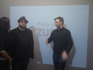
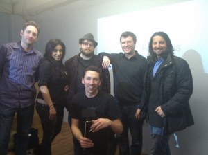
On March 1, the founders of Zurb came to Hacker Dojo to give one of their most exciting talks at our ‘IxD for Devs’ class!  Generously, they shared some of their most valuable thoughts and experiences with over 50 developers at the Dojo. The house was packed and the energy was high. Everyone was excited to have the Zurb team on board. Bryan, Jeremy, and Dmitry gave it all they had. Thank you, Guys!

In the first part, they talked extensively about how they manage to transform ideas into tangible practical stepping stones by completing the circle of idea-transformation through repeating these three steps:

  1. Deep team collaboration
  2. Reiterating sketches and expanding on the core idea
  3. Constant user-feedback through established existing networks

Skillfully, and with real-world examples, they showed their audience the ‘Zurb-way’ of tackling and addressing one of the most challenging dilemmas that many companies seem to be facing these days: the gap among Strategy, Design, and Development..

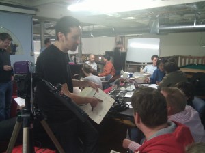
The second part got even more exciting, as they got everyone dive into the ‘Zurb-way’, by having them practice these steps. The whole room was on fire, as each team got into brainstorming and sketching ideas energetically. It was quite a revelation to watch as each idea transformed into tangible one-minute pitch. Now, that felt good!

To sum up, and in their own words, their talk was about:
“How many product ideas were built, but never really made it to market? A little of that is OK, but why does it happen so much? We don’t believe it’s because of bad ideas. We believe it’s because a holistic approach to design for people is missing inside and outside your organization.

We’re going to avoid an abstract talk in favor of a practical look at the design process and the design techniques everyone should know how to use. We’ll show you how we screwed it up on one of our products and how we got it right on the next one. A few techniques we’ll cover are:

  • Sketching to sell and open up the idea
  • Creating a product blueprint with proof points
  • Finding team overlap between Marketing, Design, Engineer functions

This people-centered, holistic approach to design makes Apple and other innovative companies what they are today. It has helped our 150+ clients create more than a billion dollars in market cap. We’ll end the talk with a hands-on example.”